

Yodel Customer App Redesign
UI, UX

Objective
The customer app had historically suffered from poor user perception, reflected in a low 1.8 App Store rating and feedback highlighting confusing journeys, limited features, and dated UI. The goal was to completely reimagine the app experience - focusing on usability, clarity, and consistency - while aligning with business goals around self-service, delivery transparency, and customer retention.
What I did
As the senior UX designer, I led the end-to-end transformation of the app by:
- Redesigning the entire app UX and UI to align with a newly established design system.
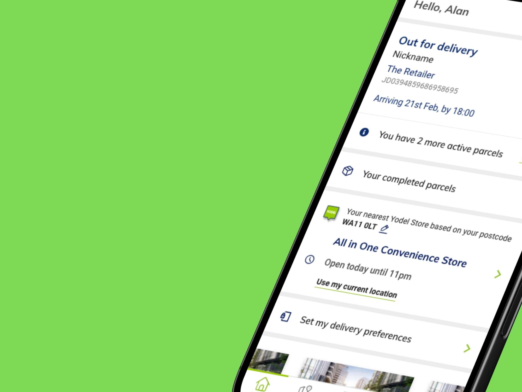
- Introducing a fully functional app homepage to surface relevant delivery actions at a glance.
- Designing a store locator tool from the ground up, optimised for both location precision and speed.
- Developing an intuitive guest onboarding and login flow, enabling one-time parcel tracking without registration.
- Leading the what3words integration for hyper-accurate delivery location selection.
- Overhauling parcel management options, including reschedule, leave safe, and delivery updates.
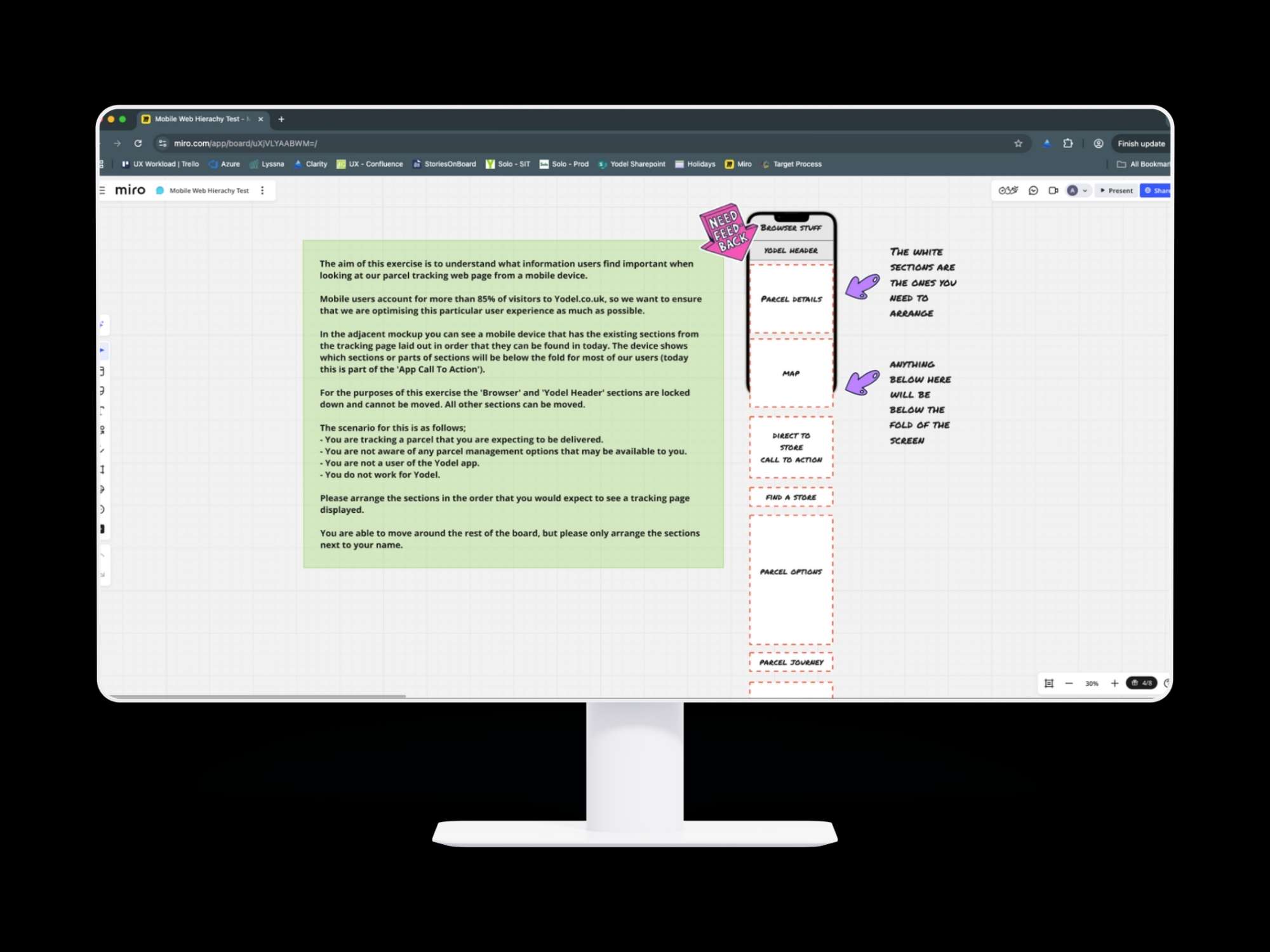
- Running usability testing and A/B experiments to inform iterative improvements.
- Implementing analytics tooling to measure interaction quality and identify friction points.
- Mentoring other designers and introducing a formal design sign-off process for dev handover.
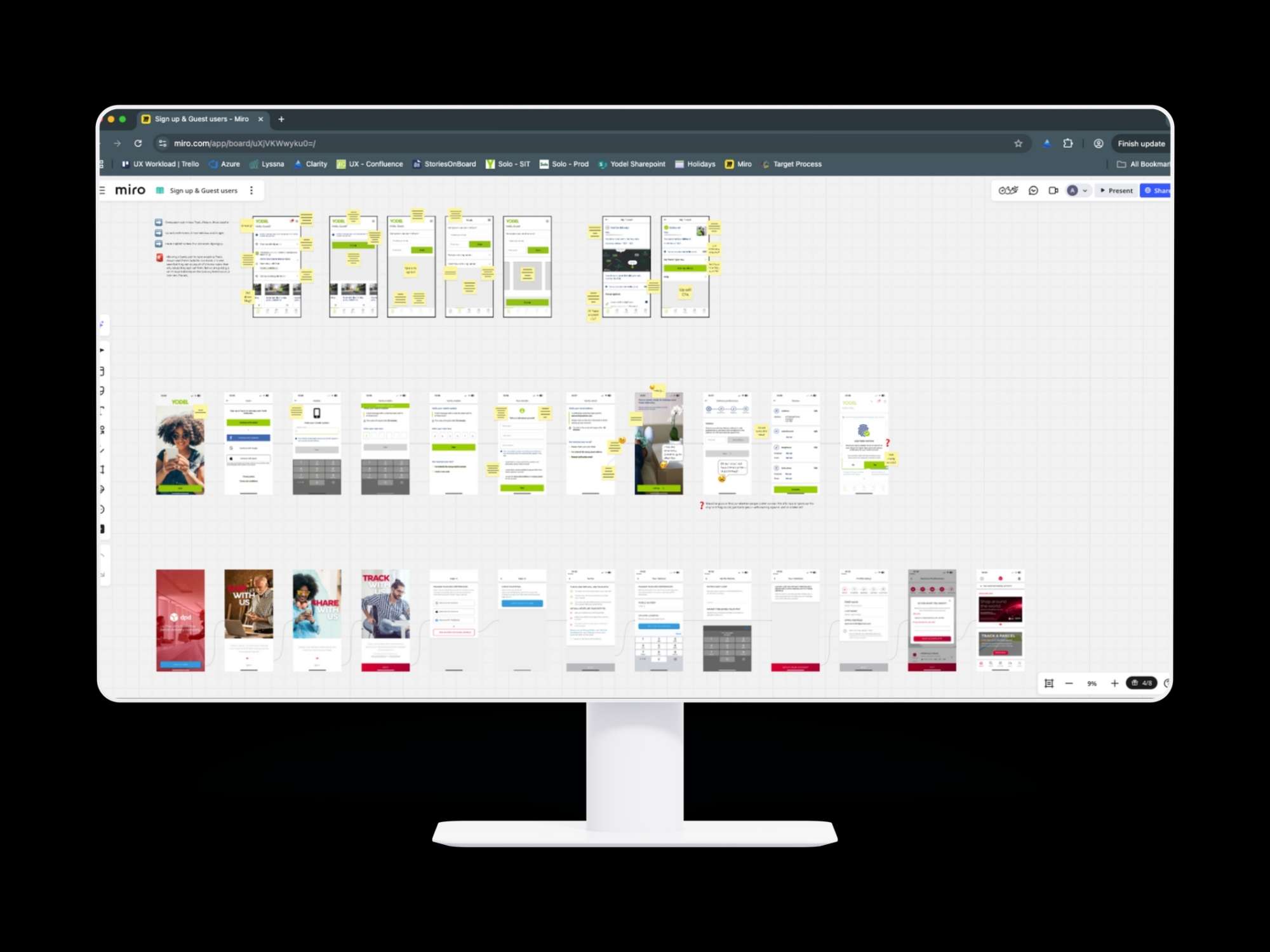
Creative Process
I began with deep research into user complaints, analytics insights, and service desk feedback to identify the core usability pain points. Mapping the user journeys helped visualise complexity and reveal gaps in the app’s value proposition. Working closely with product and engineering, I defined a roadmap that merged two legacy experiences into one modern, modular app. We designed mobile-first wireframes, tested interactive prototypes with real customers, and refined flows based on feedback - prioritising clarity, accessibility, and simplicity. A scalable design system (also introduced by me) ensured cohesion across the app and helped internal teams accelerate future feature development. Throughout, I maintained alignment with key stakeholders and ensured each feature met performance, accessibility, and business criteria
Results
- App Store rating increased from 1.8 to 4.5 stars, reflecting user satisfaction with the new experience.
- Guest login adoption increased, reducing service desk dependency and improving access for casual users.
- 25% drop in customer service contacts related to delivery instructions, thanks to redesigned parcel management tools.
- The app homepage and what3words integration received highly positive user feedback in surveys and testing.
- Design sign-off process reduced rework in development by streamlining communication between design and engineering.
- The app now serves as a strategic channel for self-service delivery management - saving time for users and cost for the business.


Conclusion
The Yodel customer app redesign showcases how strategic UX leadership, cross-functional collaboration, and a clear design system can transform a digital product’s performance. What was once a pain point for users is now a vital part of the delivery journey - earning praise, improving brand perception, and helping Yodel meet its digital transformation goals. This case exemplifies how thoughtful UX isn’t just cosmetic - it’s operationally powerful.