

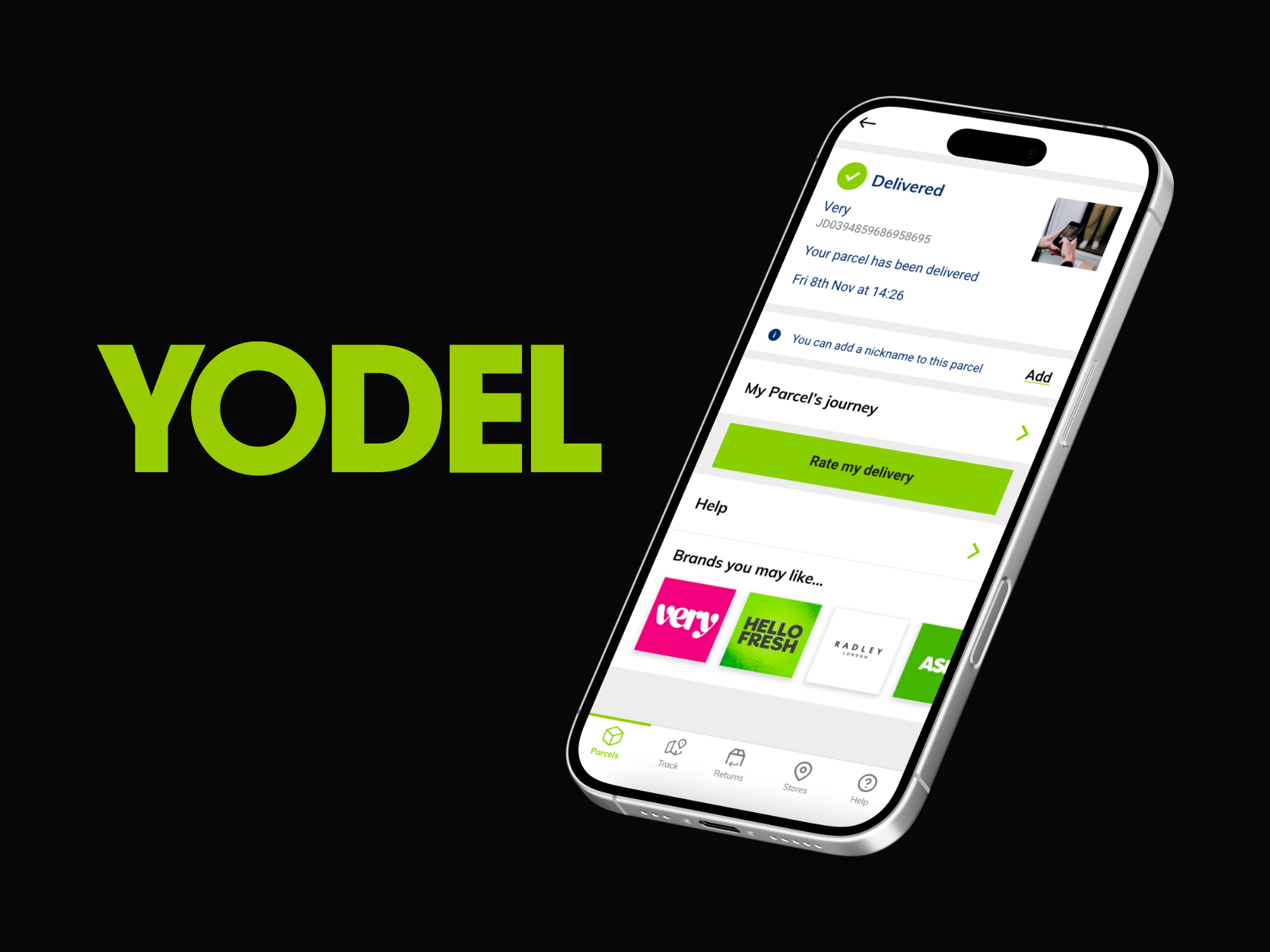
Yodel by InPost - One Brand
Bringing 2 brands under one roof
Context
Yodel was undergoing a strategic transition following its acquisition by InPost. The immediate business priority was to unify both brands under Yodel by InPost, applying a visible rebrand across web and app while accelerating customer adoption of InPost’s locker network.
This was a time-critical, commercially driven project, delivered within existing platforms, legacy systems, and active user journeys.
Polish and experimentation were secondary to speed, clarity, and business impact.
The Challenge
The project presented several overlapping challenges:
- Implementing a mini rebrand across live web and app products under tight deadlines
- Working without formal discovery or user testing phases
- Designing within imperfect, legacy systems
- Supporting a major behavioural shift from door delivery to locker-first journeys
- Balancing user experience quality with non-negotiable commercial decisions
This was not a greenfield redesign. It was a controlled transformation under pressure.
Objectives
The core objectives were clear and business-led:
- Rebrand Yodel web and app to Yodel by InPost quickly and consistently
- Introduce a new black and yellow colour system, replacing Yodel’s green and grey
- Shift key delivery and parcel management journeys to be locker-centric
- Encourage users to set InPost lockers as preferred delivery and drop-off locations
- Clearly communicate feature gaps between the Yodel and InPost apps during the transition
My Role
Senior Product Designer, working closely with:
- Product management
- Engineering
- Brand stakeholders
- Business leadership
I was responsible for:
- UX and UI design across web and app
- Flow analysis and redesign
- Messaging and behavioural nudges
- Ensuring design decisions aligned with commercial intent while remaining defensible from a user perspective
Constraints and Reality
This project was defined by constraint:
- No dedicated discovery or research phase
- No opportunity to test colour accessibility or preference
- Limited flexibility on business rules
- Partial feature parity between Yodel and InPost apps
Rather than resisting these constraints, I treated them as design inputs, not blockers.
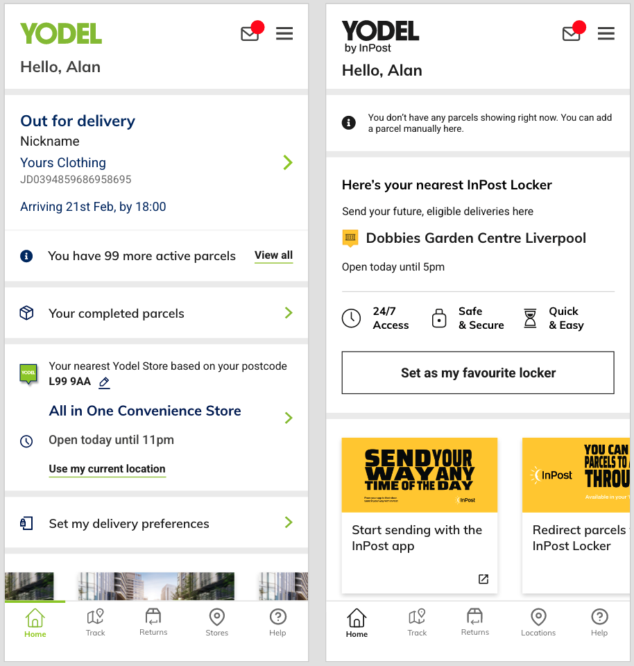
Phase 1: Rapid Brand Alignment
Problem
The business needed immediate visual alignment between Yodel and InPost without destabilising live products.
Approach
- Applied the new black and yellow colour palette across web and app surfaces
- Focused on high-impact brand touchpoints rather than exhaustive redesign
- Prioritised consistency and recognisability over visual refinement
Outcome
- Clear brand transition for users
- Minimal disruption to existing journeys
- Demonstrated ability to ship under pressure without breaking core UX patterns
This phase reinforced my ability to work pragmatically inside commercial constraints, a skill critical in large-scale, revenue-driven environments.

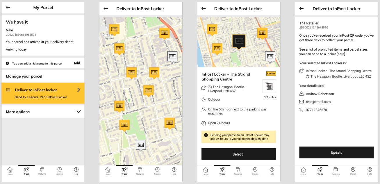
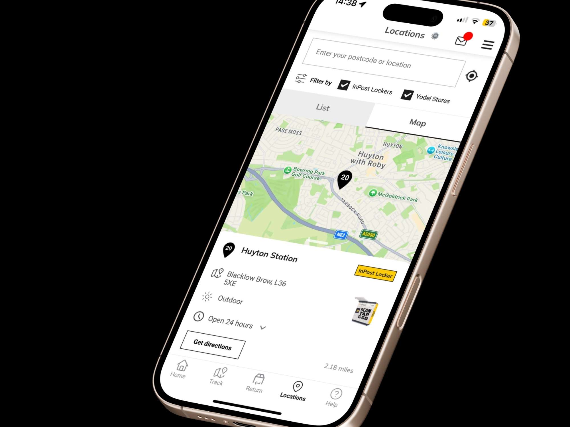

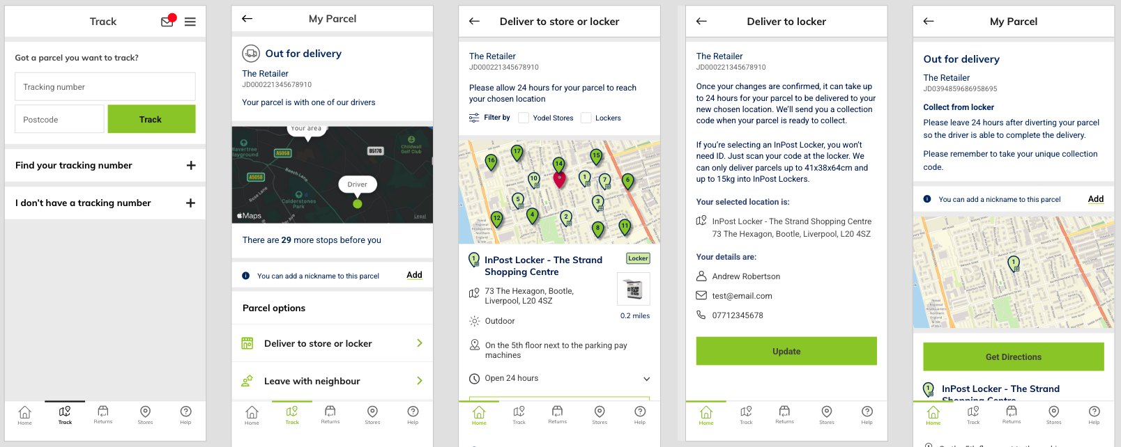
Phase 2: Locker-Centric Flow Redesign
Problem
Existing delivery preference and parcel management flows were designed around door delivery. The business objective was to grow locker usage across the Yodel customer base, even where this created UX tension.
Approach
- Analysed existing user flows to identify decision points and friction
- Designed updated journeys that surfaced locker options earlier and more prominently
- Accepted that some decisions were business-mandated, not user-led
- Focused heavily on clarity, expectation setting, and messaging
This required making decisions that did not always feel optimal from a pure UX standpoint, but were necessary to support strategic goals.
Outcome
- New locker-centric flows implemented across web and app
- Business goals supported without misleading users
- Demonstrated ability to balance user needs with commercial outcomes


Phase 3: Transitional Messaging and Modals
Problem
During the transition, certain journeys could only be completed in the InPost app, such as locker collection using QR codes.
This risked confusing and frustrating users.
Approach
- Designed clear, well-timed modals explaining when and why users needed to switch apps
- Avoided technical language in favour of plain, reassuring messaging
- Ensured users understood the reason for the handoff, not just the instruction
Outcome
- Reduced ambiguity during cross-app journeys
- Maintained user trust despite platform limitations
- Reinforced the importance of communication design, not just UI
Managing Forced Preferences and UX Risk
One of the most challenging aspects of the project was the decision that preferred lockers would override door delivery for eligible parcels.
From a UX perspective, this carried risk.
My response was to:
- Surface consequences early in the flow
- Reinforce decisions at multiple touchpoints
- Ensure users were never surprised by outcomes
This was a case where messaging strategy was as important as interface design.


Results and Impact
- Successful rollout of Yodel by InPost branding across web and app
- Clear support for InPost’s locker growth strategy
- Improved transparency in delivery preference journeys
- Demonstrated ability to deliver under real-world commercial pressure
The project is ongoing and will continue until feature parity is achieved between the Yodel and InPost apps.
Reflection
This project was challenging precisely because design craft was not the primary driver.
Creativity, exploration, and visual refinement often took a back seat to:
- Commercial urgency
- Platform constraints
- Strategic business decisions
As a senior designer, this reinforced a key principle I bring to my work:
Good product design is not about ideal conditions. It is about making clear, defensible decisions when conditions are far from ideal