
From Wireframes to Wow: My Process for Designing Intuitive Digital Products
Introduction: Design Isn’t Just What It Looks Like
It’s tempting to think of design as the “final layer”—the visual polish added just before launch. But as any experienced designer knows, intuitive products are shaped long before a screen is ever styled. Behind every seamless experience is a process of discovery, iteration, and collaboration. In this post, I’m breaking down how I approach designing digital products that feel effortless to use.
1. Start With People, Not Pixels
Every project starts with understanding who we’re designing for. Whether it’s a mobile app for delivery tracking or an internal tool for contact centre staff, I always begin by gathering insight from users. That means interviews, surveys, desk research—anything that helps me uncover their goals, frustrations, and mental models.
From there, I create user personas and journey maps to identify opportunities. At this stage, it’s not about aesthetics—it’s about clarity. What problems are we solving? What workflows need to be improved? These questions shape everything that follows.
2. Define the Structure First
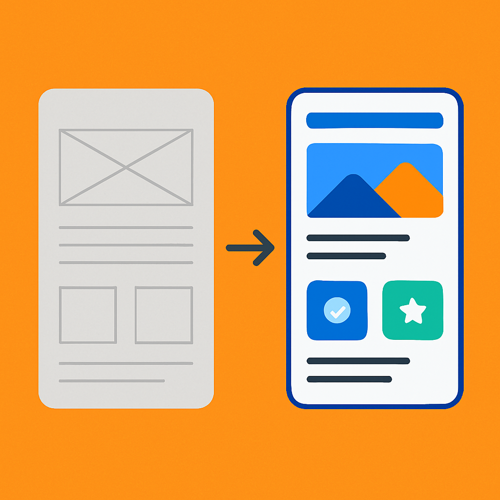
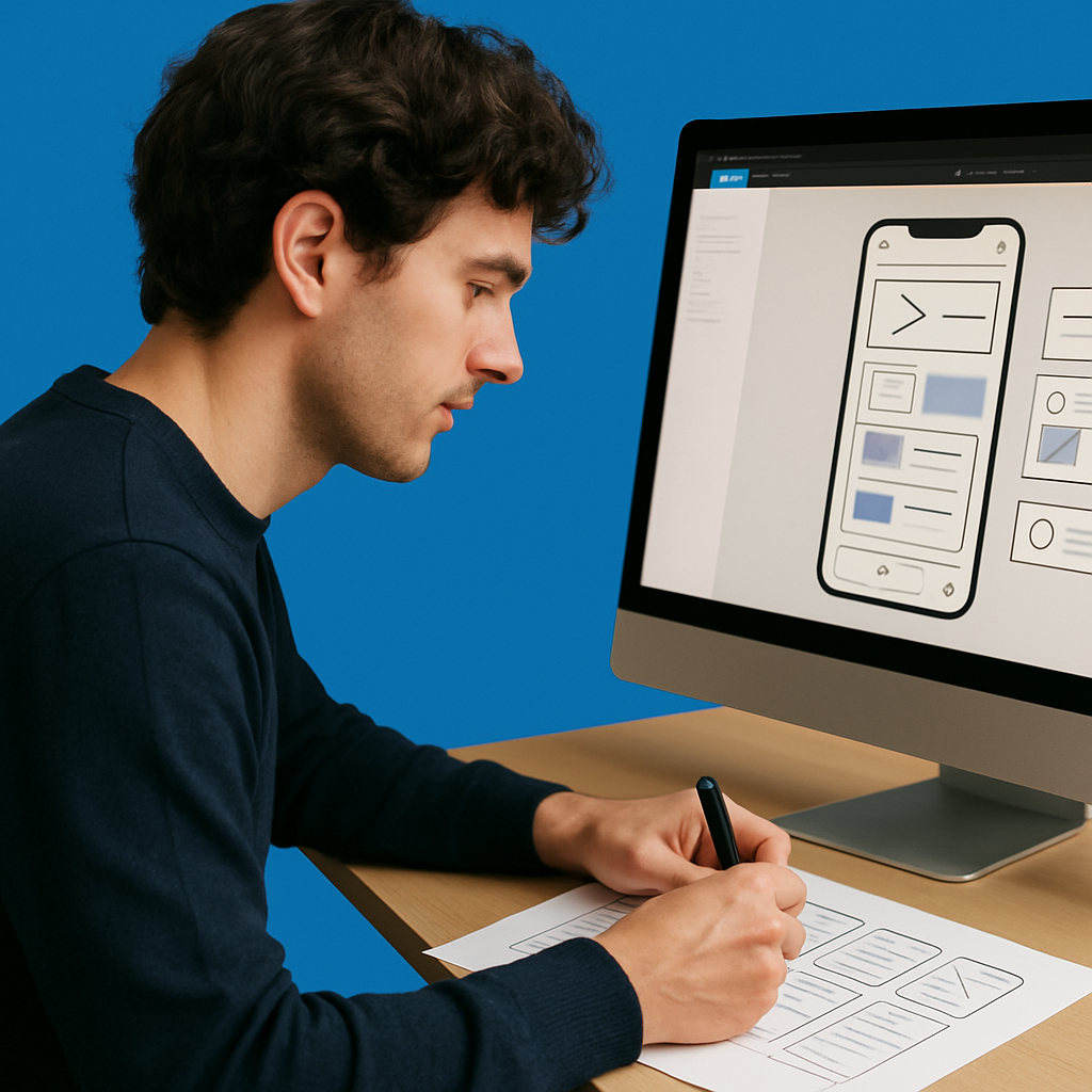
Once the problem is clear, I move on to information architecture and wireframing. This is where layout and content hierarchy take shape. I map out key user flows and structure screens around what the user needs at each step—nothing more, nothing less.
Wireframes are one of my favourite parts of the process. They allow space to think, simplify, and challenge assumptions before committing to visual design. I keep them low-fidelity so stakeholders focus on functionality, not colour schemes.
3. Iterate With Purpose
Design isn’t linear. That’s why I share early and often—both with users and the wider team. I run usability tests on prototypes, gather internal feedback, and explore different interaction patterns to validate ideas.
Some of the best improvements I’ve made came from observing users struggle in subtle ways: a button they missed, a label that confused them, a form that felt longer than it actually was. Good design listens, adjusts, and improves continuously.
4. Add Personality Through Visual Design
Once the structure works, I bring in visual design elements—colour, typography, spacing, and motion. This is where brand meets usability. I use a design system (often one I’ve helped build) to ensure consistency, responsiveness, and accessibility.
But visual design isn’t just about looking good—it’s about guiding attention, creating clarity, and reinforcing trust. Every style choice has a function. The goal is to make the interface feel natural, like it couldn’t have been designed any other way.
5. Handoff Isn’t Goodbye
A clean developer handoff is essential. I document interactions, edge cases, and breakpoints in tools like Figma and Notion, and I stay close during the build phase to ensure fidelity.
Design doesn’t stop at the handoff either. Post-launch, I review analytics, user feedback, and support tickets to find new opportunities to improve. It’s a cycle, not a sign-off.
Conclusion: Thoughtful Design Is Good Business
Designing intuitive digital products takes more than creativity—it takes structure, empathy, and iteration. The best experiences feel invisible because they’ve been carefully shaped to reduce friction and support the user at every step.
This process—starting with people, building on insight, and refining with purpose—is what turns good ideas into great products. And it’s a process I bring to every project I work on.